Tire advertising has a well-worn vocabulary: grip, durability, performance, safety. BFGoodrich Indonesia and agency Lup Jakarta looked at that vocabulary and found a different starting point. The tread patterns pressed into the surface of every BFGoodrich tire are as distinctive as a fingerprint. What if those patterns, designed to keep a vehicle connected to the road, were also capable of connecting the brand to the people driving on it?
The Design Decision
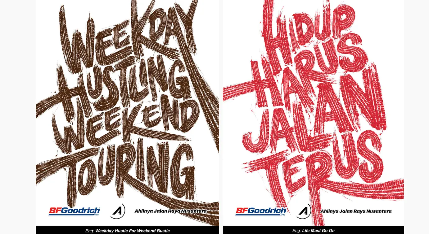
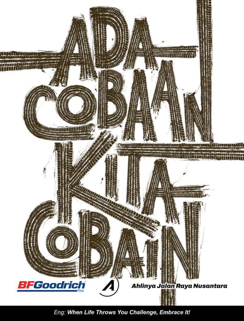
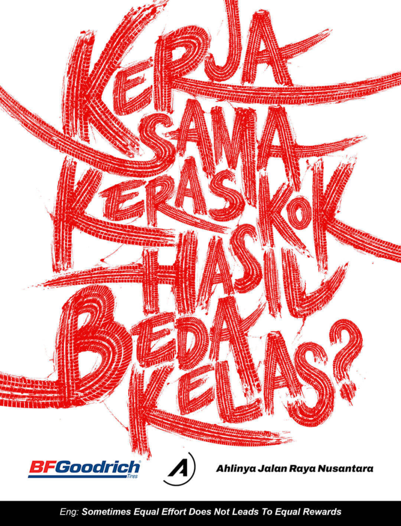
The Tire Quotes, launched in June 2026, is a print campaign built on a custom typeface developed entirely from the tread patterns of two BFGoodrich tires: the Advantage Touring T/A and the g-Force Phenom T/A. Every letter in the typeface was shaped from those tread designs. The product appears in every execution not as a photograph or a product shot but as the architecture of the text itself.
That decision resolves the most common tension in branded print advertising: how to keep the product present without making the product the subject. In The Tire Quotes, the product is the medium. The words are the message. The tire is what makes the words visible.
The Community Layer
The words themselves did not come from the agency. BFGoodrich invited its community on Instagram and at brand events to answer a single question: what quote best describes your journey? The responses reflected different experiences across the brand’s target audience of adults between 30 and 40, a period when ambitions are real, progress is uneven, and encouragement is genuinely useful rather than merely decorative.
After reviewing the submissions, BFGoodrich selected 20 quotes that became the campaign’s print executions. The community sourcing is not incidental to the campaign’s creative logic. It is what makes the typography meaningful rather than typographic. A tread pattern rendered as letters is a design exercise. A tread pattern rendered as the words of the people who drive on those tires is a brand platform.
The Strategic Context
BFGoodrich positions itself in Indonesia as “The Master of Indonesian Roads,” a claim that carries weight in a market where road conditions vary enormously across the archipelago and a tire’s performance is felt in a direct, daily way. The Tire Quotes does not reinforce that positioning through performance specifications or technical comparisons. It reinforces it through the metaphorical overlap between a road journey and a life journey, which is the only terrain where a tire brand and its customers share something more personal than a transaction.
The target audience, adults in their thirties and forties, is the demographic most likely to have accumulated the experiences that make that metaphor resonate. They have driven long roads. They have had uncertain stretches. They are aware that progress and setback are not separate categories. A campaign that takes their own words and renders them in the material of the product that carries them forward is making a claim that no specification sheet could.
The Execution
The campaign ran across print with seven primary executions, each one presenting a community-sourced quote in the BFGoodrich tread typeface against a clean background. A case study video on YouTube documents the typeface development process and the community collection methodology. The campaign was created at Lup Jakarta under Executive Creative Director Albert Chan and Creative Director Irfan Zayanto, with Senior Art Directors Gabriel Pelupessy and Kevinjune H. and Copywriter Tika Siagian leading the execution.
The production required a level of craft that most print campaigns do not ask of their designers. Building a functional, legible typeface from the physical geometry of a tire tread pattern, and then using that typeface to render messages that came from real people, required both typographic precision and creative discipline across every execution.
Why It Works
Most tire advertising cannot survive the removal of the product. Replace the tire with a competitor’s product and the campaign works exactly as well, which means the campaign was not actually about the product. Remove the tire from The Tire Quotes and there is nothing left. The letters disappear. The words disappear. The campaign disappears.
That level of product integration is rare in any category and rarer still in automotive advertising, where the product is typically the setting for the campaign rather than its medium. BFGoodrich Indonesia found the one creative decision that made the tire irreplaceable rather than interchangeable, and built a print campaign around it.
Campaign Name: The Tire Quotes
Agency Name: Lup Jakarta / Executive Creative Director: Albert Chan / Creative Director: Irfan Zayanto / Senior Art Directors: Gabriel Pelupessy, Kevinjune H. / Copywriter: Tika Siagian
Brand Name: BFGoodrich Indonesia
Location: Indonesia (print campaign, June 2026)