Most brand refreshes start from a problem: something has grown stale, or a competitor has encroached on territory, or a new generation needs to be reached. Coca-Cola’s 2026 refresh started from a different premise entirely. JKR, the brand’s lead identity agency, was given a creative brief of three words: “Make Coca-Cola more Coca-Cola.” The answer was not to design something new. It was to amplify what already existed.
What Changed and What Did Not
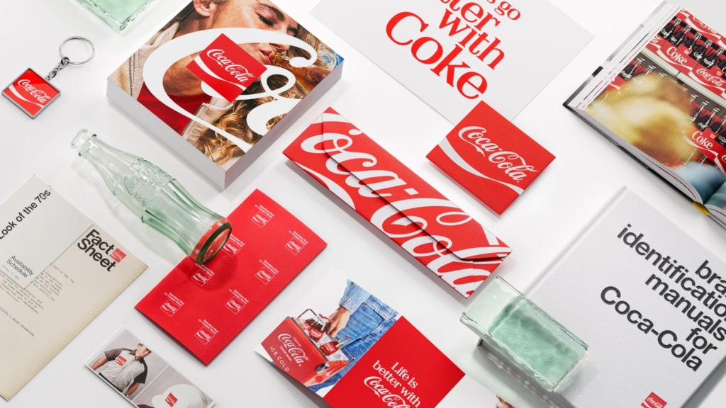
The Spencerian script, the red and white palette, the Dynamic Ribbon, and the Arden Square are not new assets. The script dates to the brand’s origins, when bookkeeper Frank M. Robinson, partner of Coca-Cola inventor John Pemberton, wrote out the brand name in flowing cursive because he thought two Cs would look striking and the style would stand out. The Dynamic Ribbon was introduced in 1969, inspired by the silhouette of the contour bottle. The Arden Square was designed the same year by Lippincott & Margulies during a period of rapid international expansion.
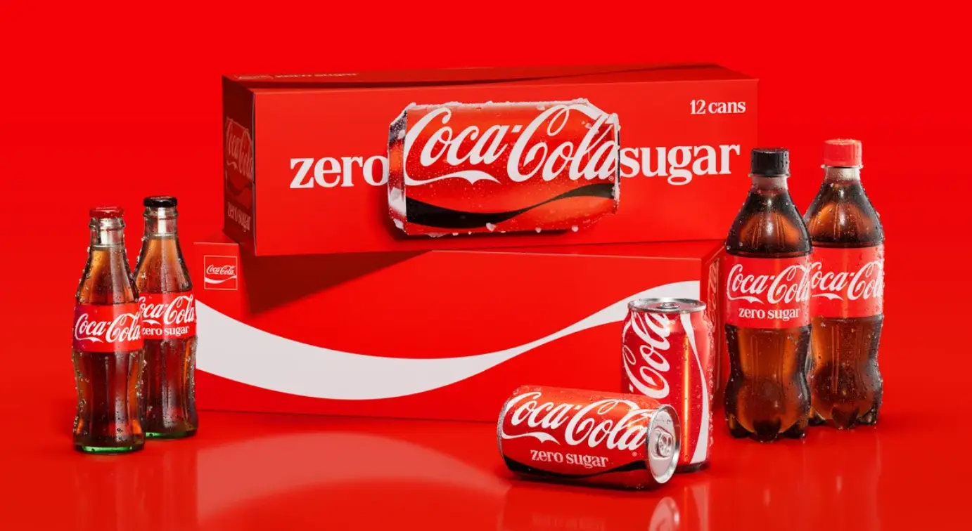
What the 2026 refresh does is give all four assets greater prominence across every surface and channel simultaneously. Packaging. Retail. Digital. Equipment. Out-of-home. Photography. Motion. Across more than 200 markets. The wordmark on cans moves to a vertical orientation. On multipacks, it gives way to a horizontal can image with the Dynamic Ribbon given a full panel and the Arden Square anchored in the corner. The update follows Coca-Cola’s last global consistency push in 2021.
Rapha Abreu, Global Vice President of Design at The Coca-Cola Company, described the governing principle: “Making Coca-Cola more Coca-Cola became our guiding principle from day one. When people think about Coca-Cola, a handful of memorable brand assets immediately come to mind: the iconic red, the Spencerian Script, the Dynamic Ribbon, the Contour Bottle, even the product itself. Those are the symbols people recognise, trust, and love. Our ambition was to double down on those distinctive assets and make them even more iconic.”
Arnab Roy, President of the Coca-Cola Global Category, described the strategic imperative: “This refresh is about being clearer and more consistent in how we show up, wherever people experience our brand. By building on the things people already know and love, we’re creating a stronger foundation for growth while staying unmistakably Coca-Cola.”
Coca-Cola Zero Sugar Gets Its Own Distinct Treatment
Within the new system, Coca-Cola Zero Sugar is differentiated more clearly than before. The wordmark appears in white. The text “Zero Sugar” is enlarged and set in a new serif typeface. Cans carry a black Dynamic Ribbon. Bottles have a black cap. The changes allow the Zero Sugar variant to be identified at a glance while remaining part of the wider Coca-Cola family, a distinction that previous iterations had not resolved cleanly.
The Production and The Tools
The packaging design system was reimagined by The SUPERULTRARARE, a specialist design studio. Typography was developed with Brody Associates. Photography standards were refreshed with photographers Guy Aroch, Anna Palma, and Martin Wonnacott. The entire system was built in collaboration with JKR.
The internal enforcement mechanism is as significant as the visual output itself. Coca-Cola has built a new “Design Intelligence” AI platform, internally referred to as Project Fizzion and powered by Adobe tools, trained on the brand’s full design archives. The platform supports internal teams and agency partners across 200-plus markets in keeping the new identity consistent as it rolls out. At the scale Coca-Cola operates, consistency is not a design problem. It is a governance problem. The AI platform addresses that directly.
The Risk the Refresh Avoids
The decision to amplify existing assets rather than redesign is not a conservative instinct masking lack of ambition. It reflects a clear reading of what goes wrong when brands of Coca-Cola’s scale attempt more significant visual changes. The M&M’s character redesign backlash and the Gap logo controversy are the industry’s most cited case studies in the cost of change for its own sake at a brand with decades of built recognition. JKR, who also rebuilt KFC’s identity around its bucket in 2026, has now applied the same philosophy twice in the same year: the most powerful brand assets are often the ones that already exist and simply need to be treated with greater confidence.
For Coca-Cola, that confidence is expressed by making the things everyone already knows bigger, bolder, and more consistent, rather than by creating anything they would need to learn.
Campaign Name: “Make Coca-Cola More Coca-Cola” / Global Brand Identity Refresh
Agency Name: JKR (Jones Knowles Ritchie) / Packaging: The SUPERULTRARARE / Typography: Brody Associates
Brand Name: The Coca-Cola Company
Location: Global (200+ markets; launched July 2026)