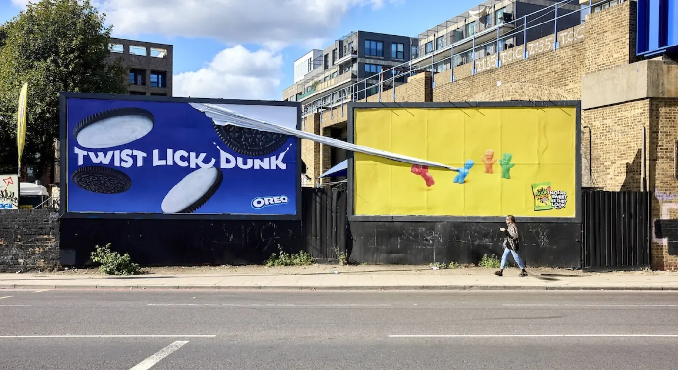
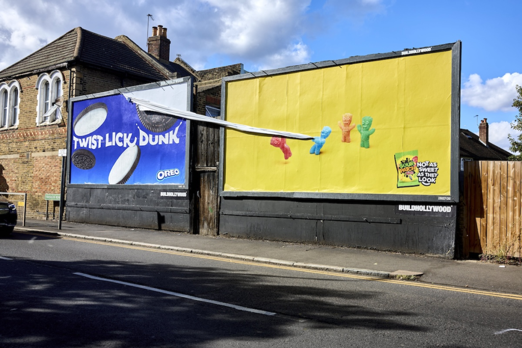
Most brands launching in a new market spend their first advertising campaign introducing themselves. Sour Patch Kids spent theirs attacking a sibling. For the sweets’ first UK outdoor campaign, VCCP did not buy Sour Patch Kids their own billboard space. They bought space next to Oreo’s existing posters in London and Bristol, and built special structures that showed the Sour Patch Kids characters physically tearing into the neighbouring boards.
The campaign is called Not As Sweet As They Look. The name is the creative strategy and the product truth delivered simultaneously.
The Social Media Feud That Made It Possible
Sour Patch Kids and Oreo are both owned by Mondelez International. They are siblings in a corporate sense, manufactured under the same parent company, distributed through the same retail channels, often found in the same supermarket aisle. On social media, they have been feuding for years.
The Sour Patch Kids brand has built a significant following on TikTok and Instagram by roasting Oreo in comment sections, quote tweets, and direct brand-to-brand exchanges that the audience of both accounts has come to expect and anticipate. The feud is performed rather than genuine, a creative strategy that gives both brands a reason to show up in digital spaces where food brands are usually irrelevant. It works because both parties commit to the bit and because the audience that follows both accounts has been primed to recognise when the next shot arrives.
The creative decision behind Not As Sweet As They Look was to take that established social media dynamic and give it a physical form. The comment-section roast became a special-build billboard. The online exchange became an outdoor installation. The audience that had been following the feud on screens was given a version of it they could walk past on the street.
The Executions
Four special-build sites in London and Bristol were constructed adjacent to existing Oreo poster placements. The Sour Patch Kids characters in each execution are physically interacting with the Oreo advertising boards next to them: tearing into the paper, pulling at the edges, damaging the neighbouring poster with the specific energy of a character who has been waiting a long time to escalate from the comment section to something more physical.
The wider outdoor campaign extended the same personality across executions that did not require a neighbouring Oreo board to make their point. One poster shows a tug of war in which a Sour Patch Kids character is being pulled in half. Another depicts a tennis match that has taken an unexpectedly aggressive turn. The creative thread running through all of them is the same: the Sour Patch Kids characters look sweet and behave otherwise. The product’s sour component is not a flavour note. It is a personality type.
St Marks Studio produced the special-build outdoor executions. VCCP’s Girl&Bear handled content production for the social and digital extensions of the campaign. Publicis POP30 managed media planning and buying. Adam Sears and Ben Evans created the campaign under creative director Liam Wilson, with VCCP chief creative officers Chris Birch and Jonny Parker overseeing the work.
Why the Format Landed
The special-build billboard that damages an adjacent board is a creative format with a specific precedent in UK outdoor advertising. The approach requires a media buy precise enough to guarantee adjacency, a structural build that interacts physically with the neighbouring surface, and a brand personality bold enough to justify the creative aggression.
Sour Patch Kids met all three conditions. The media buy placed them next to Oreo. The special build gave the characters a physical presence that extended beyond the frame of their own board. And the brand’s established social media personality, built on years of roasting Oreo in digital spaces, had already earned the aggression. The billboard was not the introduction of a new behaviour. It was the escalation of an existing one into a new medium.
Chris Birch and Jonny Parker, VCCP’s CCOs, described the work with the brevity it deserved: “Simple, clever, beautiful and disturbing.” Sarah Haworth, brand manager at Mondelez International, described the campaign’s relationship to the product itself: “They might look sweet and innocent, but there’s always a sour little surprise with Sour Patch Kids.”
The UK Launch Context
Sour Patch Kids are a significant confectionery brand in the United States and Canada, where they have been one of the bestselling sweets since the 1980s. The UK market represented a genuine launch rather than an extension, which made the creative brief both more straightforward and more demanding. More straightforward because there was no existing UK brand image to protect or refresh. More demanding because the brand had to establish itself in a new market without any of the cultural familiarity it carries in North America.
The decision to launch through a feud rather than an introduction reflects a specific understanding of how Gen Z and millennial audiences in the UK engage with brands. Both demographics respond more readily to brands that demonstrate a personality than to brands that describe their credentials. The personality Sour Patch Kids had already built on social media, chaotic, aggressive, loyal to the bit, was its most transferable asset from the US to the UK market. The billboard campaign led with that asset rather than with flavour descriptions, pack shots, or retail availability messaging.
The campaign runs across the UK and Republic of Ireland through September and October 2026.
Campaign Name: Not As Sweet As They Look
Agency Name: VCCP / CCOs: Chris Birch, Jonny Parker / Creative Director: Liam Wilson / Creatives: Adam Sears, Ben Evans / Content Production: VCCP Girl&Bear / Special-Build Production: St Marks Studio / Media: Publicis POP30
Brand Name: Sour Patch Kids / Mondelez International
Location: London and Bristol, United Kingdom (special-build OOH; outdoor, digital, social; September to October 2026)