Disney is one of the most protective companies in the world when it comes to its brand identity. Its signature wordmark, the flowing script that has appeared on every film, theme park, and piece of merchandise the company has ever produced, is not something that gets cut in half and combined with another brand’s logo for a billboard campaign. Except in October 2026, when it did exactly that, and the advertising industry could not stop talking about it.
The Brief
Canadian Disney+ subscribers can access Hulu content directly inside their Disney+ app. Most of them do not know this. The Hulu library includes The Kardashians, Scrubs, Futurama, and hundreds of other titles that Disney+ Canada had quietly made available through its platform. The audience for those shows existed in Canada. The awareness that the shows were there did not.
Courage, the Toronto-based creative agency behind the campaign, identified the communication problem and found the solution in the two brand names themselves. Hulu starts with “Hu.” Disney contains “Dis.” Put them together in a single line and you get “Hu Dis?”, which is how a generation raised on text messages asks “who is this?”
The Executions
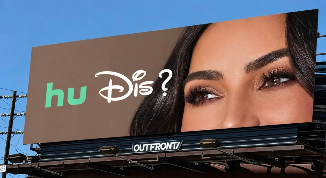
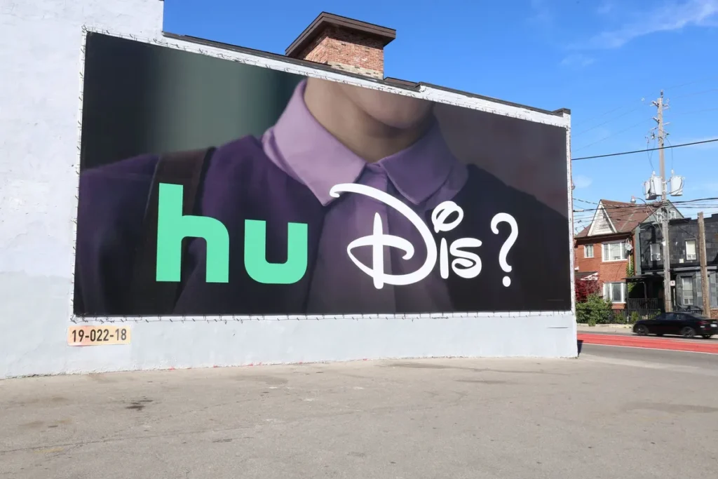
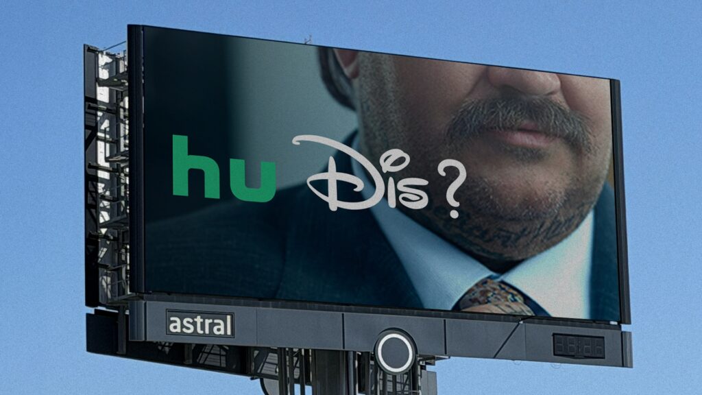
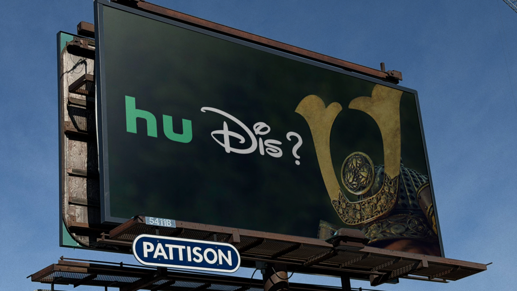
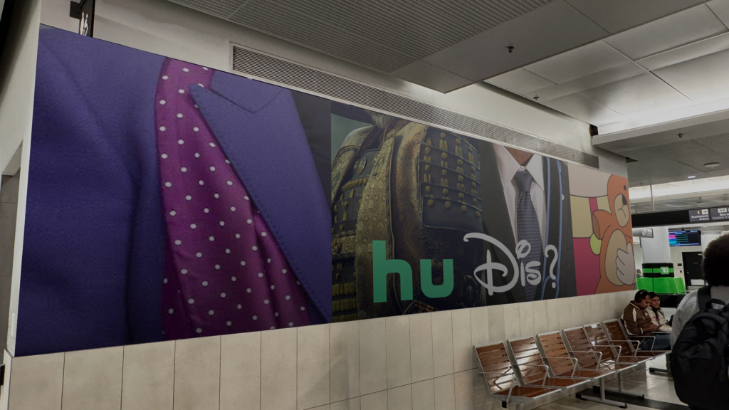
The campaign takes the first two letters of Hulu’s name in Hulu’s signature green and pairs them with the first three letters of Disney’s name in Disney’s signature font and style, creating a combined graphic that reads: “Hu Dis?” The two half-logos sit side by side as a question.
Below them are tight-cropped images of characters and stars from shows available through Hulu on Disney+ in Canada. One execution pairs the question with a close crop of Kim Kardashian’s eyes, which are recognisable to anyone who has watched The Kardashians and ambiguous enough to everyone else that the “Hu Dis?” genuinely functions as a question before it functions as a punchline. Another features Bender, the robot character from Futurama, in the same tight-crop format that makes the campaign’s visual system work: enough of the face to be familiar, not enough to remove all mystery.
The campaign ran across OOH and digital outdoor placements before expanding across digital, social, broadcast, and CTV.
What Disney Agreed To
The most discussed element of the campaign is not the wordplay. It is the fact that Disney approved it.
Disney’s wordmark is among the most consistently protected brand assets in the world. The specific letterforms, the characteristic flourish, the weight and proportion of each character have remained functionally unchanged across decades of global brand management. Companies in possession of logos that iconic do not typically agree to chop them in half for a regional Canadian billboard campaign. Disney agreed because the campaign’s creative team recognised something that brand guardians at most companies would resist: even half of the Disney wordmark is more recognisable than most other brands’ full logos.
Copywriter Vikki Ross captured the advertising industry’s reaction when she saw the campaign: “Woahhhhhhhhhhhhhhhhhhh never thought I’d see Disney play with their logo.”
The Unorthodox Blend newsletter described what the Disney half-logo demonstrated in practice: “Obviously there’s been others like McDonald’s or Corona but I never thought Disney would be this brave with its marque, which shows exactly how recognisable it is.”
Why the Idea Works
The campaign solves its communication problem with a single visual gesture. Disney+ Canada’s challenge was to tell subscribers that Hulu content was available inside their existing subscription. A conventional approach would describe the feature, name the shows, and run the information as a product announcement. The Hu Dis? campaign runs the same information as a question asked in the visual language of both brands simultaneously.
The question is the answer. “Hu” is Hulu. “Dis” is Disney. The combined graphic names the integration it is advertising before the viewer has processed it as an advertisement. For anyone who recognises either logo, the campaign communicates its message in the time it takes to read two syllables.
The tight-crop celebrity and character executions extend the campaign’s central mechanic into the content itself. The same question that asks “who are these two brands together?” applies to the faces looking back from the billboard. It is a campaign built on double recognition: the logos and the stars, both familiar, both slightly withheld, both asking the viewer to look twice.
The Broader Context
The Hu Dis? campaign follows Disney+’s previous Canadian campaign, A Lifetime of Great Stories, which communicated the breadth of the platform’s catalogue through an emotional film spanning childhood to parenthood. Where that campaign addressed the emotional depth of what Disney+ contains, Hu Dis? addresses the practical expansion of what the platform now includes. Both campaigns serve the same subscriber retention and acquisition purpose from different creative angles.
The campaign’s comparison to Kellogg’s OG poster, which cropped its wordmark to give Cornelius the Cockerel a new title, is accurate in its creative logic: both put familiar fragments to work in a new context. What distinguishes Hu Dis? is the scale of the brand whose logo was fragmented. Kellogg’s is a recognisable brand. Disney is one of the most recognisable marks in human commercial history. Courage persuaded Disney to treat its own wordmark as raw material, and the result is one of the most-discussed OOH campaigns of October 2026.
Campaign Name: Hu Dis?
Agency Name: Courage, Toronto
Brand Name: Disney+ Canada / Hulu
Location: Canada (OOH, digital, social, broadcast, CTV; launched October 2026)