Most hospital advertising describes services. Mary Free Bed Rehabilitation Hospital and Extra Credit Projects, Grand Rapids, found a different approach in August 2013: build the billboard so it looks like the condition being treated, and let the medium do the explaining before a single word is read.
The Campaign
The outdoor campaign for Mary Free Bed Rehabilitation Hospital consists of three executions, each one built around a different condition the hospital treats: spinal cord rehabilitation, concussion rehabilitation, and brain rehabilitation. Every billboard in the series uses its own physical format as the visual representation of the condition named on it.
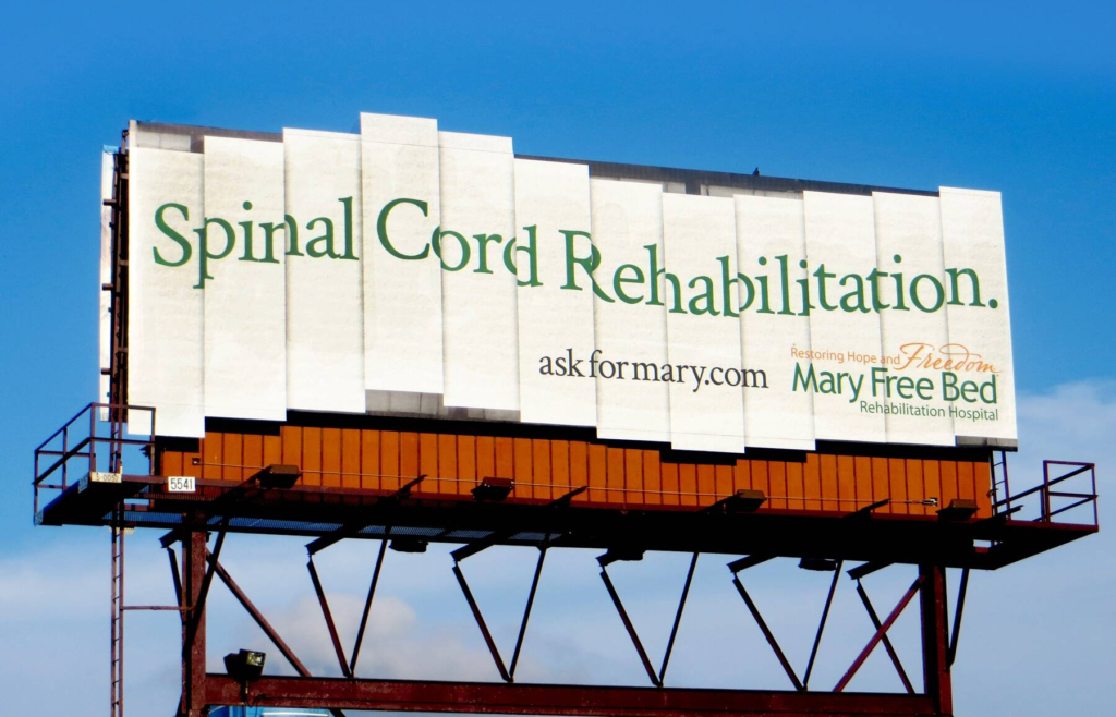
The spinal cord rehabilitation billboard was constructed from multiple vertical segmented panels, arranged in the same stacked, separated structure as the vertebrae of a human spine. The name of the condition is printed across the segmented surface. A person driving past the board sees a spinal column before they read a word. The structure and the subject are the same object.
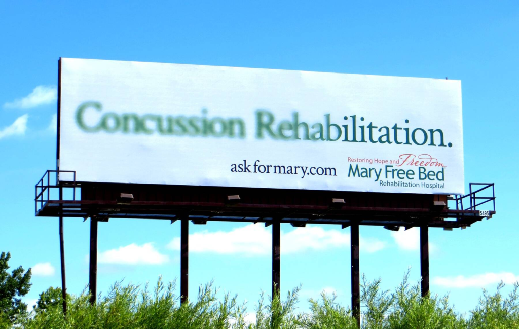
The concussion rehabilitation board uses a cracked, shattered visual treatment, as though the billboard surface itself has sustained impact damage from a blow. The effect is immediate: the medium looks damaged in the same way the brain looks when a concussion is visualised. The word “concussion” appears across the fractured surface.
The brain rehabilitation board extends the same principle, using a visual approach that evokes the complex, folded surface of the human brain in the billboard’s design structure itself.
The Creative Team
The campaign was developed at Extra Credit Projects, Grand Rapids, Michigan, under Creative Director Rob Jackson, with Art Director Chad Hutchison and Copywriter Henry Kook. Extra Credit Projects has served as Mary Free Bed’s creative agency of record since 2011, a partnership that has produced multiple outdoor campaigns for the hospital over the years.
The Creative Logic
The campaign’s governing principle is the same across all three executions: identify the most immediately recognisable visual representation of the condition being treated and build the billboard in that format. The audience does not need to read the headline to understand what service is being advertised. The headline confirms what the structure has already shown.
This approach resolves one of healthcare advertising’s most persistent communication challenges. Medical conditions are difficult to visualise for general audiences without either clinical imagery, which can be distressing, or abstraction, which reduces impact. The billboard format allows Mary Free Bed to make the conditions immediately legible through structural analogy rather than medical photography or technical language.
A segmented billboard looks like a spine. A cracked billboard looks like a concussion. The brain billboard looks like the organ whose rehabilitation the hospital provides. Every condition is made visible without showing a single patient, a single piece of clinical equipment, or a single medical diagram.
The Broader Creative Pattern
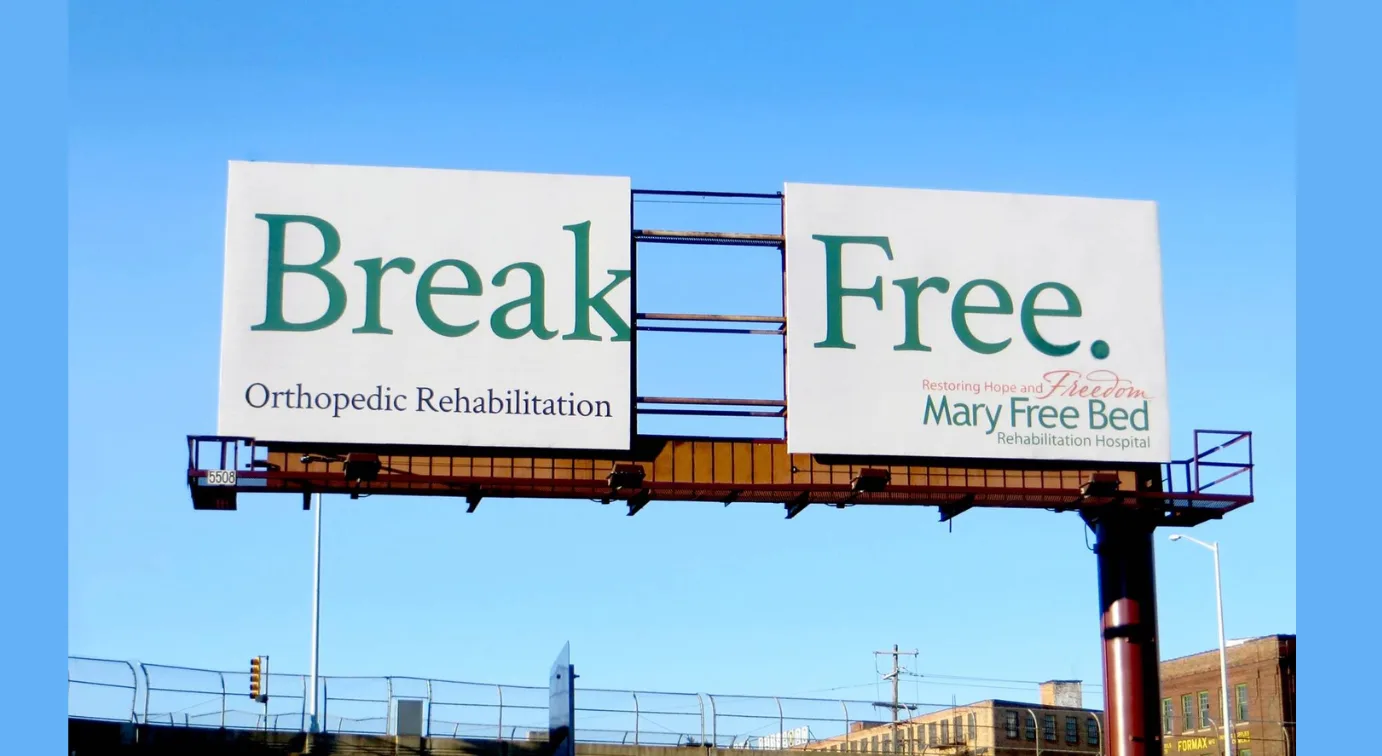
The split billboard for orthopedic rehabilitation, showing the two words “Break” and “Free” separated by the physical gap between two outdoor panels, follows precisely the same rule applied to a different service and a different format. The gap in the billboard is the break. The word “Free” is the rehabilitation outcome. The two panels together, with their unavoidable joint, communicate everything about orthopedic recovery in a visual that requires no copy to set up.
Taken together, the Mary Free Bed outdoor campaign series across multiple years represents one of the most consistent applications of medium-as-message creative thinking in healthcare advertising. The hospital did not change what it was communicating from campaign to campaign. It found a new structural format for the same governing principle each time it returned to the brief.
The Institutional Context
Mary Free Bed Rehabilitation Hospital is based in Grand Rapids, Michigan, and has been ranked among the top rehabilitation hospitals in the United States by U.S. News and World Report. During its creative partnership with Extra Credit Projects, the hospital grew from 80 beds to 167 and saw a 774% increase in patients served. The billboard campaign contributed to a brand awareness strategy that made Mary Free Bed the recognised rehabilitation provider in its regional market.
The campaign’s longevity in advertising reference lists, where it continues to appear more than a decade after its 2013 publication, reflects the durability of the creative principle it applied. A billboard that looks like the condition it is treating does not go stale when the product cycle changes. The human spine looks the same in every year.
Campaign Name: Spinal Cord Rehabilitation / Concussion Rehabilitation / Brain Rehabilitation
Agency Name: Extra Credit Projects, Grand Rapids, Michigan, USA / Creative Director: Rob Jackson / Art Director: Chad Hutchison / Copywriter: Henry Kook
Brand Name: Mary Free Bed Rehabilitation Hospital
Location: Grand Rapids, Michigan, USA (OOH Outdoor, August 2013)