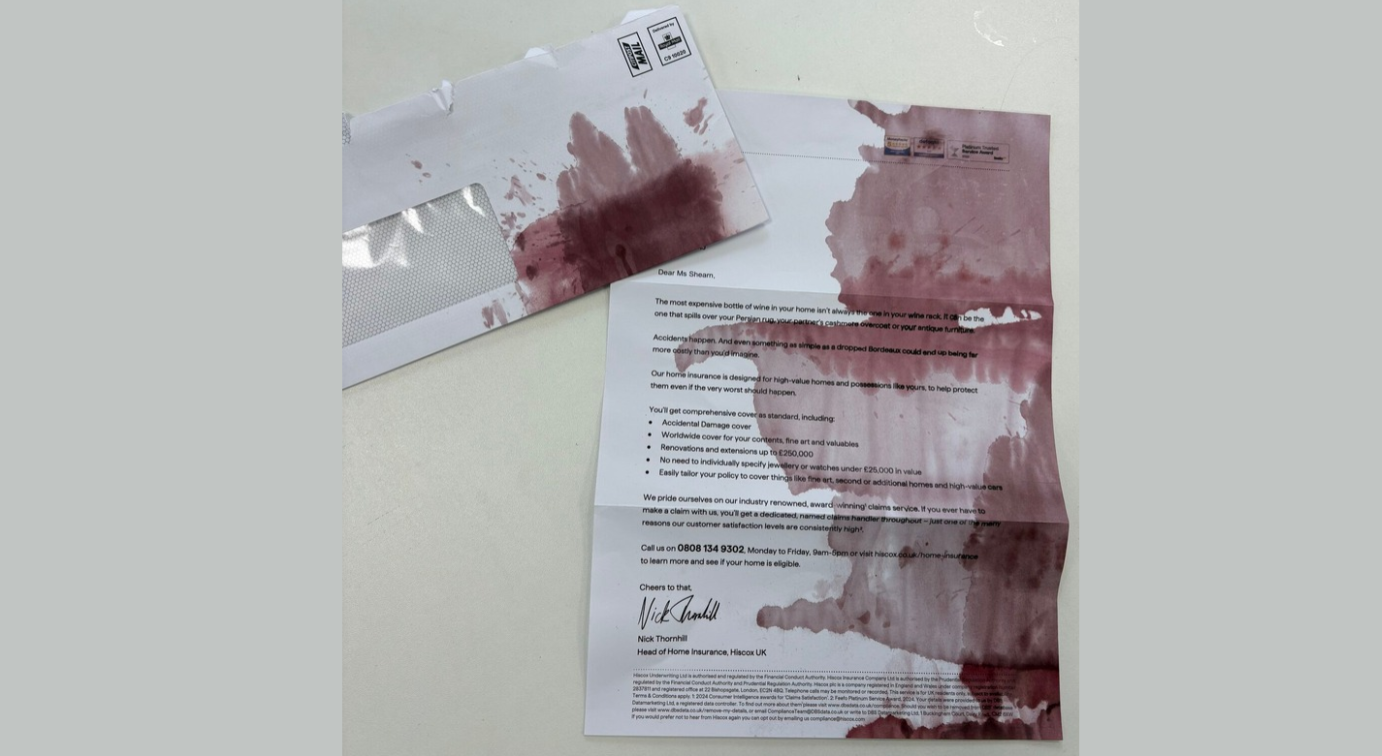
Hiscox is posting letters that look as if someone knocked a glass of red wine across them. The stain is the sales pitch. Each letter uses the mess on the page to show homeowners how a small accident at home can become an expensive claim.
What Lands on the Doormat
The mailer arrives looking like an ordinary personalised letter from an insurer. Then the reader sees the damage. Crimson splashes run across the page and parts of the text are smudged, as though a bottle tipped over while the letter lay open on a table.
The effect is deliberate. A recipient reacts the way they would to a real spill, with a second of alarm before they realise what they are holding. Ed Birth, head of brand marketing at Hiscox, has described the format as tangible, and that physical quality is the whole idea. A banner ad can describe a spill. A stained letter puts one in the reader’s hands.
The Line Under the Stain
The copy sets up the joke and the product together. It tells readers that the most expensive bottle in their home “isn’t always the one in your wine rack.” The costliest one could be the bottle that ruins a Persian rug, a partner’s cashmere coat or a piece of antique furniture.
From there, the letter introduces Hiscox home and contents insurance for high-value properties. Instead of listing what accidental damage cover includes, it shows a minor household slip becoming a bill most people would never expect.
Who Found It in Their Post
Hiscox chose its recipients with care. Birth explained on Royal Mail Marketreach’s Mail Unleashed podcast that the brand targeted individual postcodes and skipped nearby streets where homes were worth less. It also used third-party renewal data to time the letters for when people were likely to be renewing their home and contents cover.
That targeting suits a product built around expensive belongings. The letter reaches people who actually own the rugs, coats and antiques it mentions, at the moment they are already thinking about insurance.
Why the Brand Kept It Light
Insurance advertising often leans on worst-case scenarios. Hiscox chose humour instead. “We don’t want to be a business that sells on fear,” Birth said. The wine stain frames risk as an everyday mishap rather than a catastrophe.
The mailer is Hiscox’s first campaign focused on home insurance in several years, and the brand has said more will follow. It comes after “The Most Disastrous Campaign Ever,” which borrowed the branding of Specsavers, Weetabix and Cillit Bang to promote cover for copyright infringement. One billboard from that campaign rewrote the Specsavers line as “You should’ve gone to Hiscox.”
How Far the Stain Spread
Many brands have cut back on direct mail, which helped the letter stand out. One recipient, Ruth Shearn, shared hers on LinkedIn, and the piece went on to appear as The Drum’s Ad of the Day and in other trade titles.
Hiscox tracks responses through dedicated phone numbers. Birth said the brand was pleased with the number of calls, though it has not published any figures.
The letter lets the reader experience the accident before reading about the cover.
Campaign Name: Not mentioned
Agency Name: Not mentioned
Brand Name: Hiscox
Location: United Kingdom