Removing your logo from an advertisement sounds like a creative risk. For a small number of brands, it is the opposite. It is proof of something that most brands never achieve: that the audience’s memory does the work the logo usually performs. The identity has been absorbed so completely that it survives on visual fragments alone. A shape. A colour. A shadow. A bottle silhouette. The brand is present without being named, and everyone still knows exactly who put the ad there.
This is not a creative strategy available to most brands. It is a privilege earned over decades, and a handful of companies have used it precisely and brilliantly.
McDonald’s: The Most Consistent Practitioner
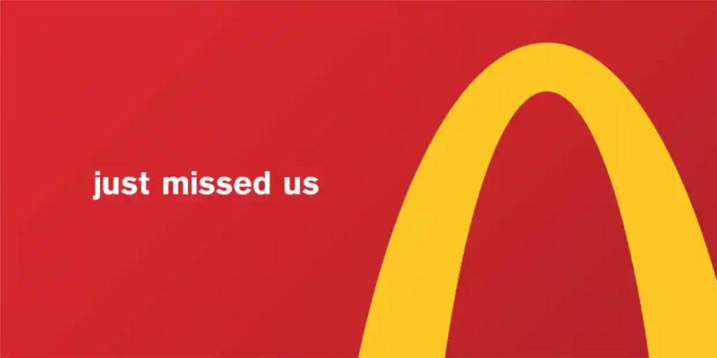
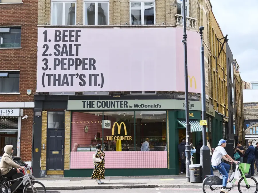
McDonald’s has run more logo-free campaigns than any other brand, across more countries, formats, and decades than any competitor in the category. The consistency of the approach makes it the reference point for every other brand attempting the same thing.
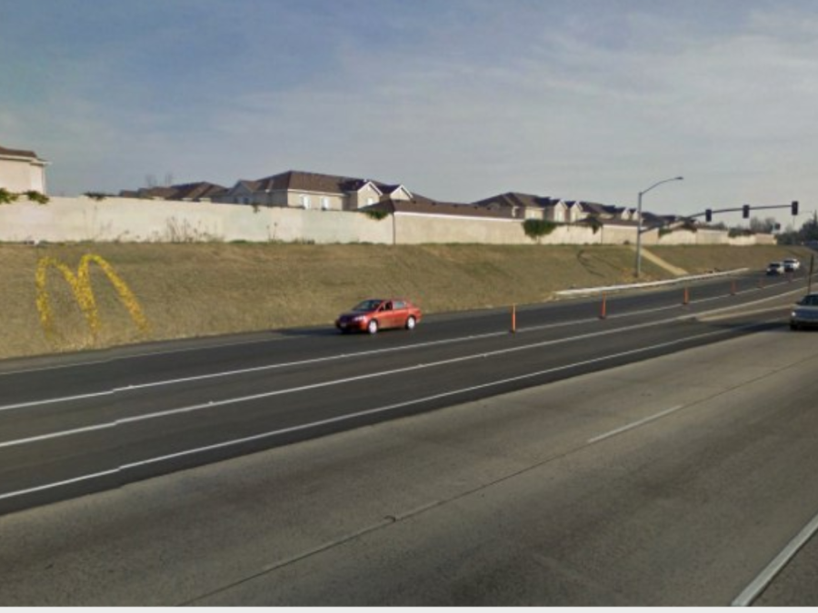
“Follow the Arches” in Canada in 2018 is the purest version. Cossette took the Golden Arches logo and cropped it into four directional signs: a left turn, right turn, U-turn, and straight ahead. Each partial arc, just two curved lines, was used as a wayfinding sign directing drivers to a nearby McDonald’s. No name. No tagline. The arches became infrastructure. The campaign won a Cannes Lions Grand Prix in Outdoor.
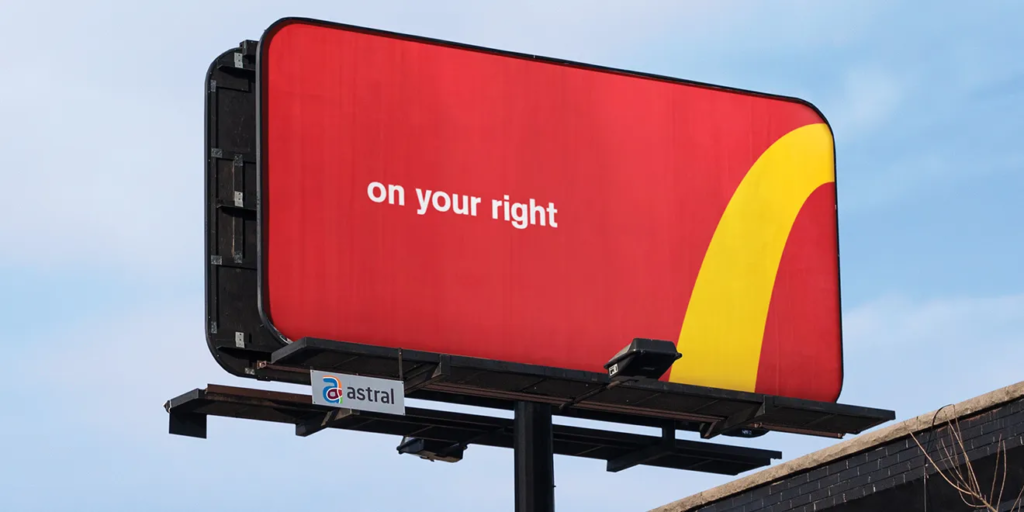
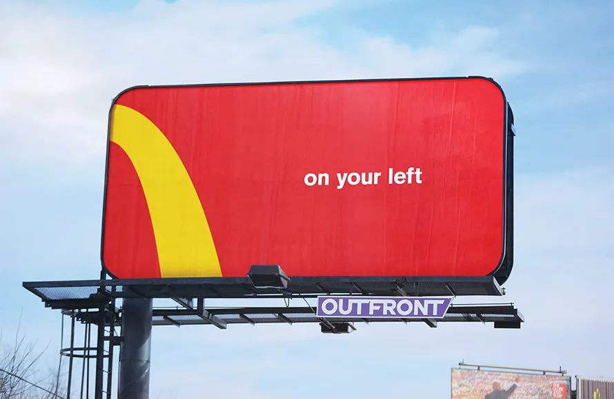
France has produced multiple iterations. In 2013, close-up product photography of fries and a burger with no branding at all. In 2020, an image of fries bitten into the shape of the arches. In 2019, “Say No More” in Puerto Rico showed only a recognisable drink, bag, and box arrangement. In 2020, “Iconic Stacks” in the UK photographed the parts of McDonald’s menu items from above in recognisable configurations, with no logo visible anywhere.
“You Know Where” in New Zealand in 2026 continues the approach. The McDonald’s format is so embedded in the global visual vocabulary that the brand can remove its name from an ad and still be accurately identified by the arrangement of the food inside the packaging.
Coca-Cola: The Shadows and the Smile
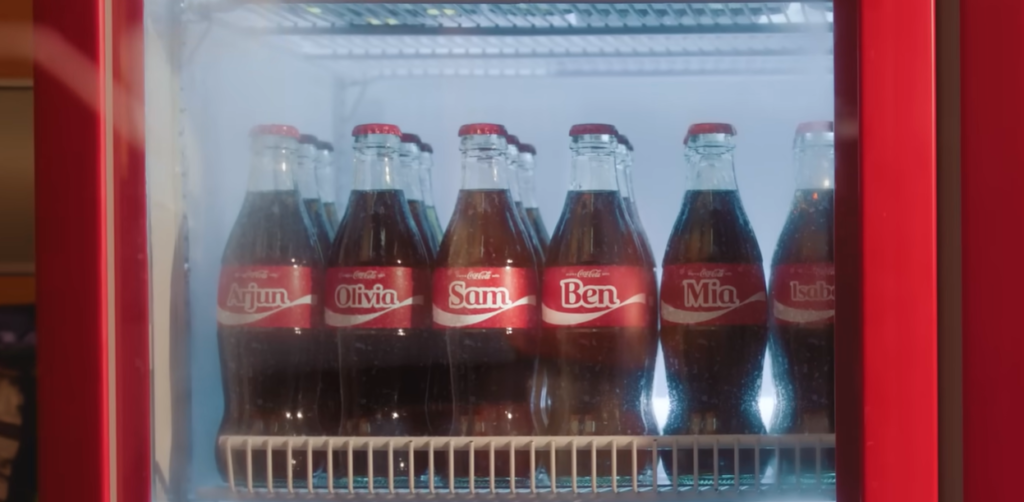
Coca-Cola’s version of logo removal is older and perhaps more structurally significant than any other brand. Share a Coke, launched in Australia in 2011 and subsequently rolled out across 120 countries, replaced the Coca-Cola wordmark on bottles and cans with people’s first names. The logo did not appear on the label where the logo normally lives. Sales went up. Brand awareness went up. The name was not needed because the bottle shape, the red, the font, and the ritual of the product were already carrying the brand entirely on their own.
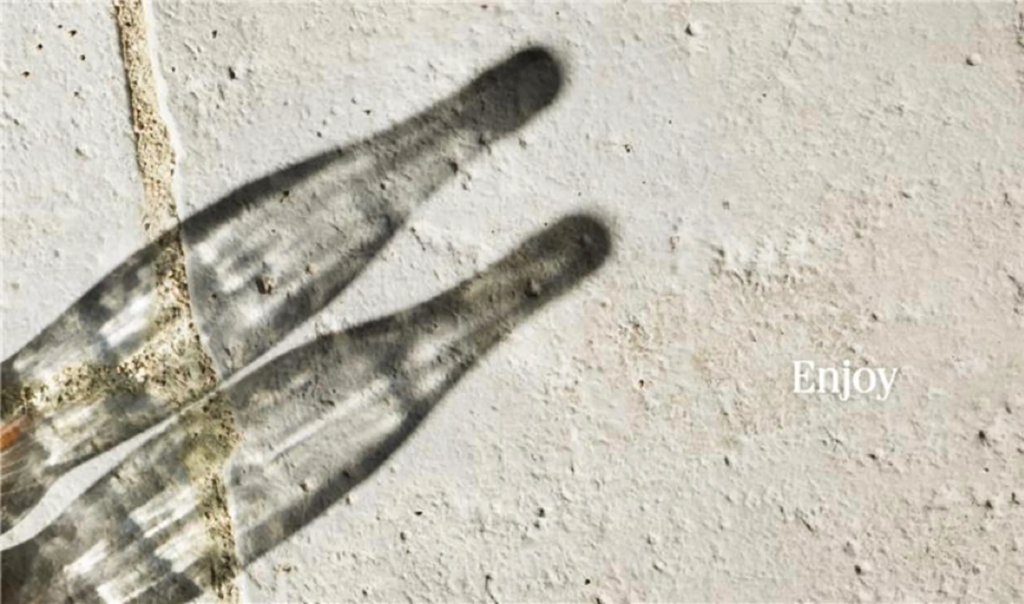
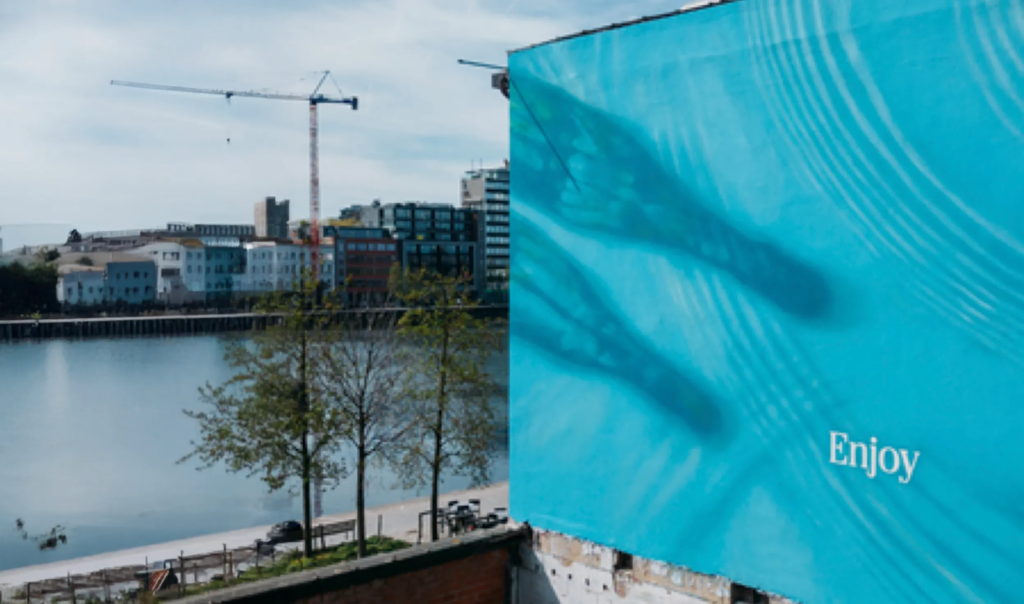
In 2025, Coca-Cola’s “Shadows” campaign ran in the UK, Belgium, Denmark, and Germany with a different mechanic. Everyday objects, a glass, a hand, a bottle, casting shadows that resolve unmistakably into the Coca-Cola bottle silhouette. The campaign contains no wordmark, no red background, and no product shot in the conventional sense. The bottle shape, owned and protected in design registration, does the entire communicative job. Recognition lives in the silhouette.
The smile ribbon, the curved underside of the Coca-Cola logotype, has also been isolated and deployed independently in global campaigns. Removed from its parent lettering and placed on packaging or OOH, it reads as Coca-Cola to audiences who have grown up seeing it on billions of surfaces.
Heinz: The Trigger and the Ketchup Red
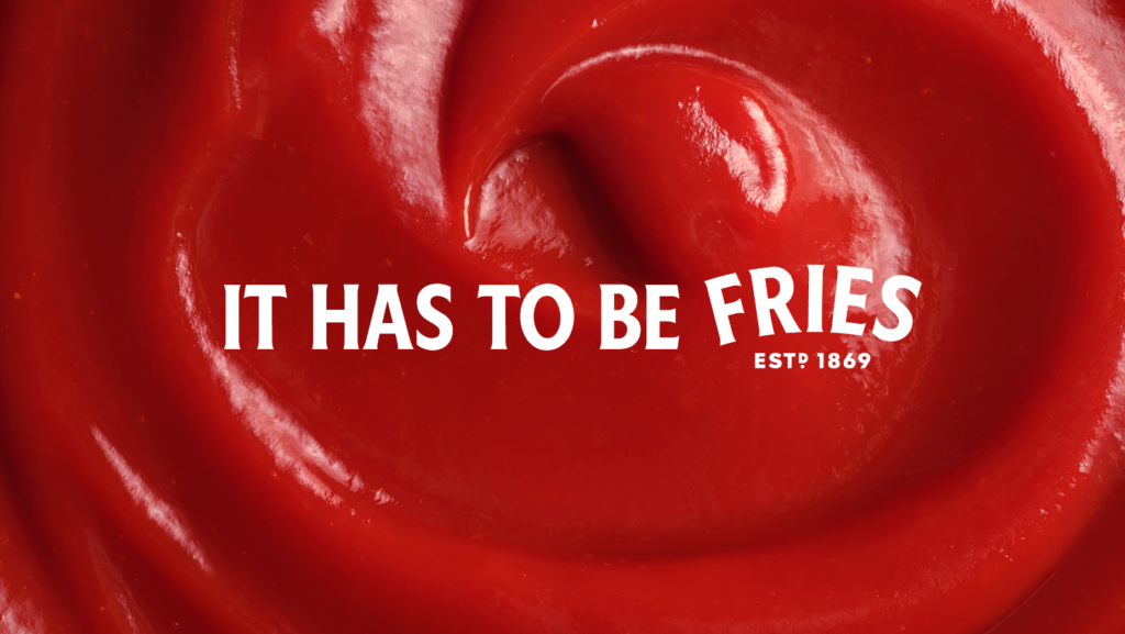
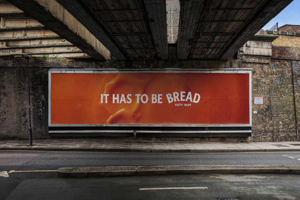
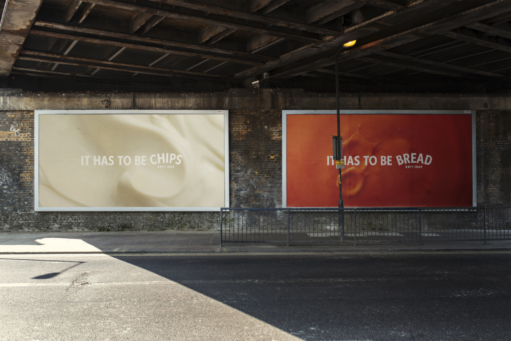
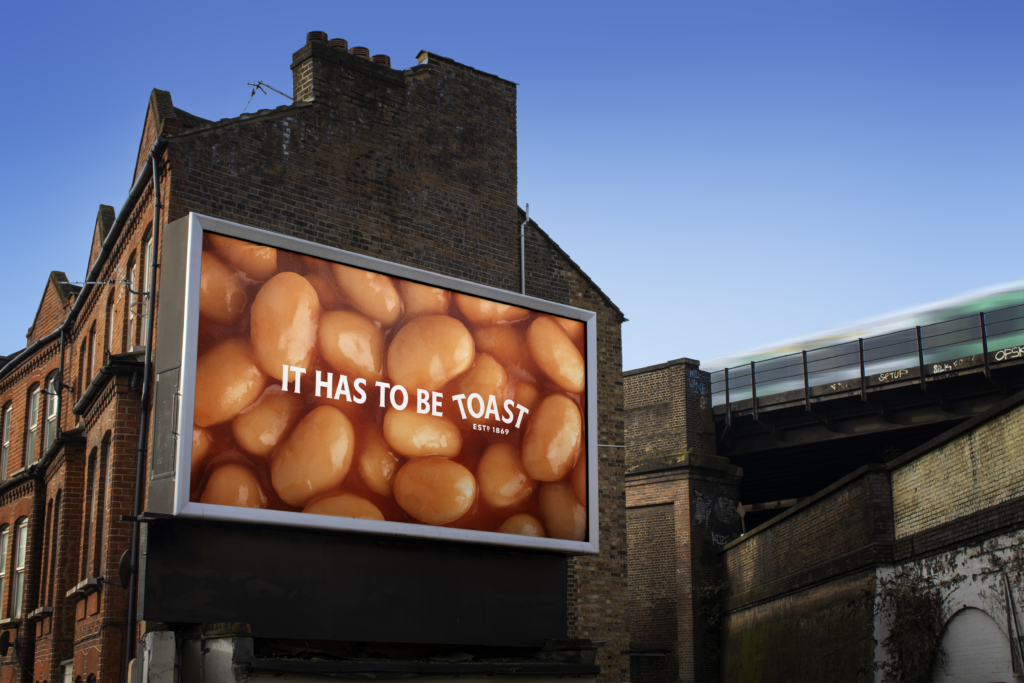
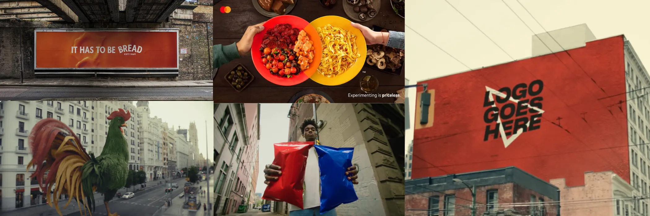
Heinz’s “Trigger the Taste” campaign, developed for the UK in 2025, ran outdoor advertising with no wordmark, no product name, and no distinctive packaging visible. The executions used only the Heinz ketchup red and abstract imagery that triggered the sensory memory of ketchup without depicting it. The campaign relied entirely on colour association. That single shade of red, combined with a particular visual context, was sufficient for audiences to identify the brand immediately.
The approach works for Heinz because Heinz Red is not a colour that belongs to anyone else in the category. After more than 150 years of single-minded colour ownership, the brand has reached a position where the colour itself functions as the logo. Removing the name does not remove the brand. It removes only what was already redundant.
Kellogg’s: The OG
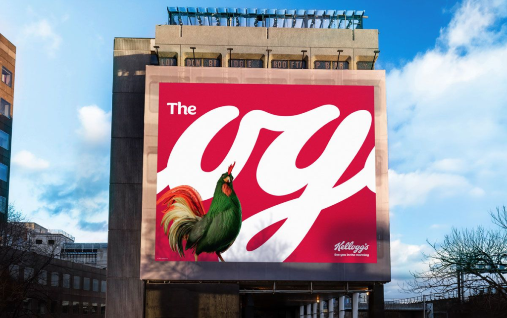
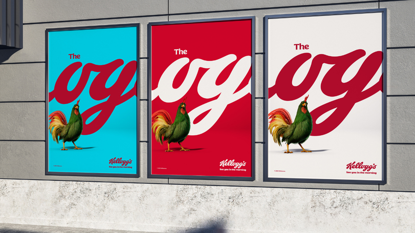
Kellogg’s “The OG” campaign from 2025 used a piece of the brand’s own logotype to communicate across European markets. The letters “OG” appear in the Kellogg’s wordmark, and the campaign isolated them as a standalone billboard element, playing on the slang meaning of “original gangster” while positioning Corn Flakes as the original breakfast. The rest of the logo did not appear. The partial wordmark, in the Kellogg’s typeface, on a Kellogg’s red, was sufficient.
Leo Burnett UK, the agency behind the campaign, had already built the “See You in the Morning” platform around a 3D animated Cornelius the Cockerel character visible from the front of every Corn Flakes box. The brand identity had enough depth and recognition that a single fragment of its typography could function independently.
Doritos: The Anti-Ad
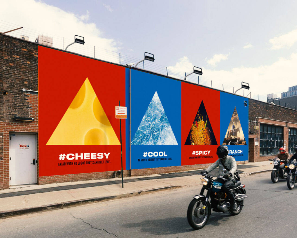
In August 2019, Doritos launched “Another Level” in the United States, described as an Anti-Ad. The campaign removed the logo entirely, replacing it with the words “Logo Goes Here” on plain red and blue chip bags representing the brand’s two hero flavours, Nacho Cheese and Cool Ranch. Doritos’ Twitter handle changed to @Logo_Goes_Here. The website became thelogogoeshere.com, which displayed only the message “What products? You already know.”
The OOH placements featured the triangular shape of the chip at the same angle used on every Doritos pack, with the caption “Logo Goes Here” superimposed across it. The triangle is the brand. The brand did not need to say so. Rachel Fernando, SVP of Marketing at Frito-Lay, described the campaign’s target directly: it was built for a generation that is not a fan of ads. The argument was that a brand iconic enough to be named by its shape alone does not need to behave like a brand that needs to be seen.
Mastercard: Two Overlapping Circles Are Everywhere
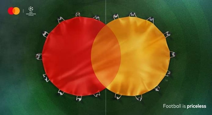
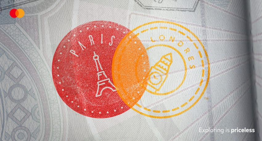
In 2019, Mastercard dropped the wordmark from its logo entirely, leaving only the two overlapping circles, one red, one yellow. The following year, McCann Colombia’s “Believe in Experiences” print campaign demonstrated how far that visual equity had travelled. Two plates of food overlap in the same geometry. Two hot air balloons. Two footballs in mid-air. Two hats on a beach. In every execution, the red and yellow circular overlap resolved immediately into the Mastercard logo. No name, no wordmark, no additional context. The objects changed. The recognition did not.
Mastercard brand tracking confirmed 80% of consumers recognise the overlapping circles without the name attached. The decision to remove the wordmark was not a creative gambit. It was a recognition that the name had become redundant.
The Rule That Makes All of This Work
The brands that can remove their logos without losing recognition share a single structural characteristic. They have spent decades building one specific, ownable visual element, a bottle shape, a colour, a pair of circles, a triangle, an arch, with such consistency and scale that the element itself carries the full weight of brand identity. The logo is no longer the recognition device. It is one expression of something deeper that the audience already carries in memory.
The rarest flex in modern advertising is no logo at all. But it only works after you have been everywhere first.