Every year in Spain, approximately 8,000 people die from medication errors. A significant portion of those deaths are caused by a problem so obvious it has gone unaddressed for decades: most pharmaceutical packaging looks almost identical. The same box dimensions. The same colour families. The same typefaces. The same graphic conventions repeated across thousands of different drugs. For a young person managing one prescription, the uniformity is inconvenient. For an elderly patient managing five or six, in failing light, with diminishing vision, it is dangerous.
VML Health, working with Madrid-based pharmacy network TuPharma365, identified the root cause and built a design system around it.
The Research
VML Health began by conducting a systematic analysis of Spain’s most commonly prescribed medications, documenting packaging dimensions, colour ranges, typographic treatments, and graphic styles across the full spectrum of frequently dispensed drugs. The findings confirmed what pharmacists and geriatric care specialists had been observing for years: the pharmaceutical packaging industry had converged on a homogeneous visual language that prioritised brand consistency over patient safety.
The analysis was conducted through the lens of gerontological design, a field that applies research into the cognitive, visual, and physical changes associated with ageing to design problems. Older adults experience reduced contrast sensitivity, decreased ability to distinguish between similar colours, slower processing of complex visual information, and increased difficulty reading small text under variable lighting conditions. Standard pharmaceutical packaging was built for none of these realities.
The Solution
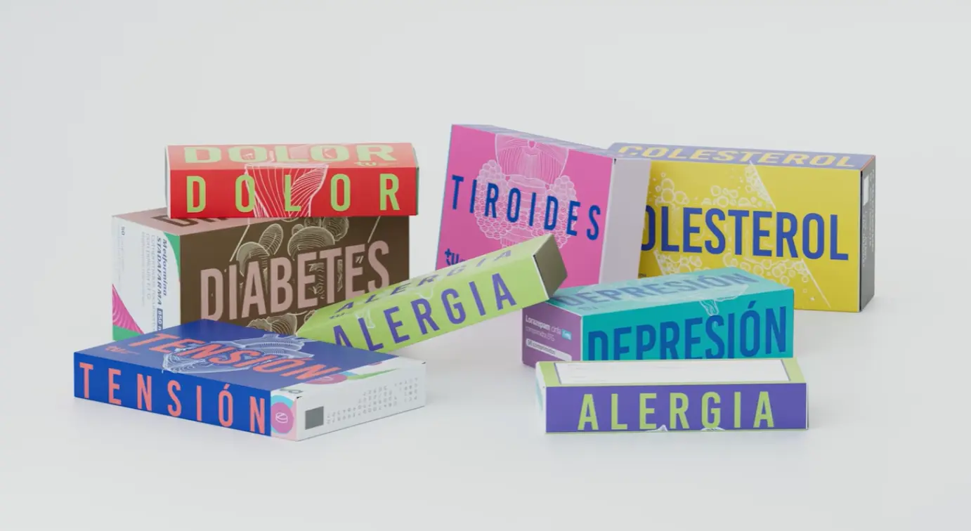
The Safe Pack is an adaptable sleeve system that fits around existing medicine boxes. Pharmacists provide the sleeves when dispensing prescriptions, making the intervention happen at the most important point in the medication journey: when the patient first receives the drug and the instructions for taking it.
The design system is built on five principles drawn directly from gerontological research. High-contrast colour coding assigns each major therapeutic category its own distinctive colour, making the broad category of drug identifiable at a distance before any text is read. Ultra-legible typography uses large, well-spaced lettering in typefaces optimised for low-contrast vision. Intuitive iconography supplements text with visual symbols representing the condition being treated: a heart for cardiac medication, a thermometer for fever treatment, a sun and moon for timing instructions. Adaptable sizes ensure the sleeve system scales across the full range of packaging formats used across different drug families. Matte finishes reduce glare, which is a significant barrier for older adults viewing packaging under overhead lighting.
Each sleeve also includes a dedicated space for the pharmacist to write personalised notes, timing reminders, dosage instructions, and warnings specific to that patient’s prescription. The sleeve becomes a communication tool between the pharmacist and the patient rather than simply a packaging redesign.
The Rollout
The Safe Pack launched across 20 pharmacies in major Spanish cities through the TuPharma365 network. Pharmacists actively provide the sleeves alongside prescribed medication at point of dispensing. The next phase makes the design templates available as free downloadable files on TuPharma365’s website, allowing any pharmacy anywhere to print and apply the system without purchasing proprietary materials.
That open-access distribution decision is the campaign’s most structurally significant element. A proprietary packaging redesign would require pharmaceutical manufacturers to adopt a new standard, a process that would involve regulatory approval, supply chain changes, and commercial negotiations across the entire industry. The sleeve system bypasses every one of those barriers. It arrives at the pharmacy counter as a printed piece of paper that costs almost nothing to produce and requires no change to existing manufacturing or distribution.
Natxo Díaz, Global Head of Craft at VML Health, framed the design imperative directly: “The aim is to ensure that something as critical as taking the right medication doesn’t depend on reading tiny text or remembering complex names. With The Safe Pack, patients can quickly identify which medicine they’re taking, helping to prevent potentially life-threatening mistakes.”
The Recognition
At the 2026 Clio Health Awards, The Safe Pack won four Gold Lions across Creative Strategy, Print and Out of Home Craft Art Direction, Packaging Design, and Human Centred Design, alongside Silver in Innovation and Direct and Bronze in Design Craft Production Design. The sweep across multiple Clio Health categories reflects the campaign’s unusual breadth: it is simultaneously a strategic intervention, a design system, a healthcare product, and a public health initiative.
The Clio Health jury’s recognition across Human Centred Design specifically is what carries the most weight. Human-centred design, by its definition, is evaluated on how well the solution serves the people it was built for rather than the audience observing it. Eight thousand annual deaths from medication errors in Spain are the brief. A sleeve that a pharmacist can hand to an elderly patient and that patient can read from a metre away in the kitchen is the answer.
Campaign Name: The Safe Pack
Agency Name: VML Health, Madrid and New York
Brand Name: TuPharma365
Location: Spain (20 pharmacies across major Spanish cities; free templates for national distribution)