For 150 years, Heinz ketchup and fries have been understood as inseparable. The brand did not need to prove the pairing. What it needed, as cheaper rivals began to take shelf space and inflation-weary shoppers started trading down, was to move the consumer’s mind from “fries need ketchup” to “fries need Heinz specifically.” Rethink Toronto found the answer sitting on every fast food counter in the world.
The Insight
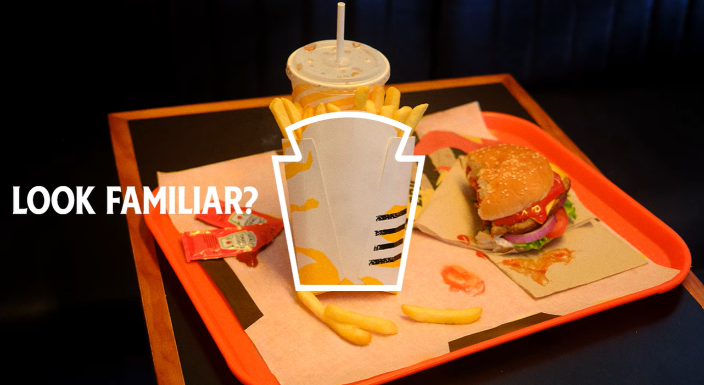
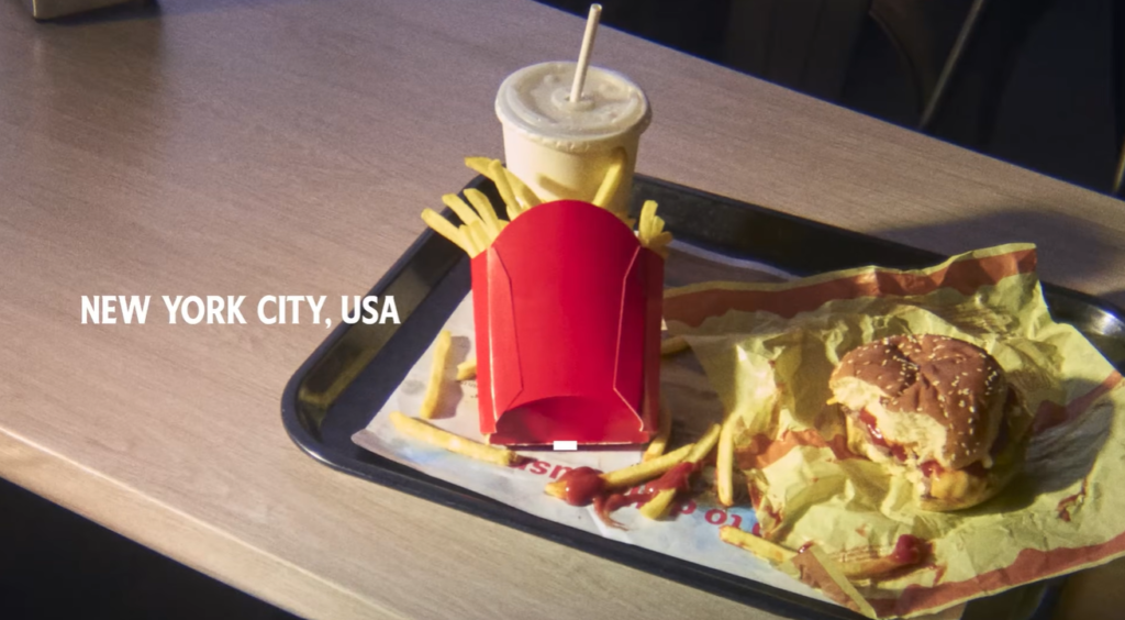
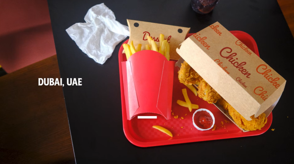
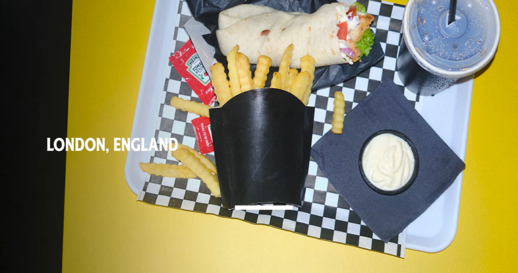
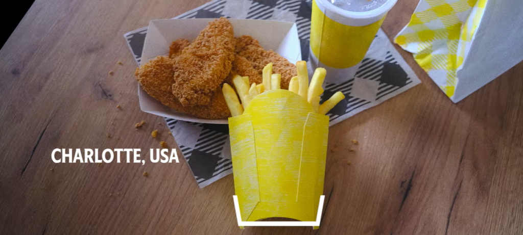
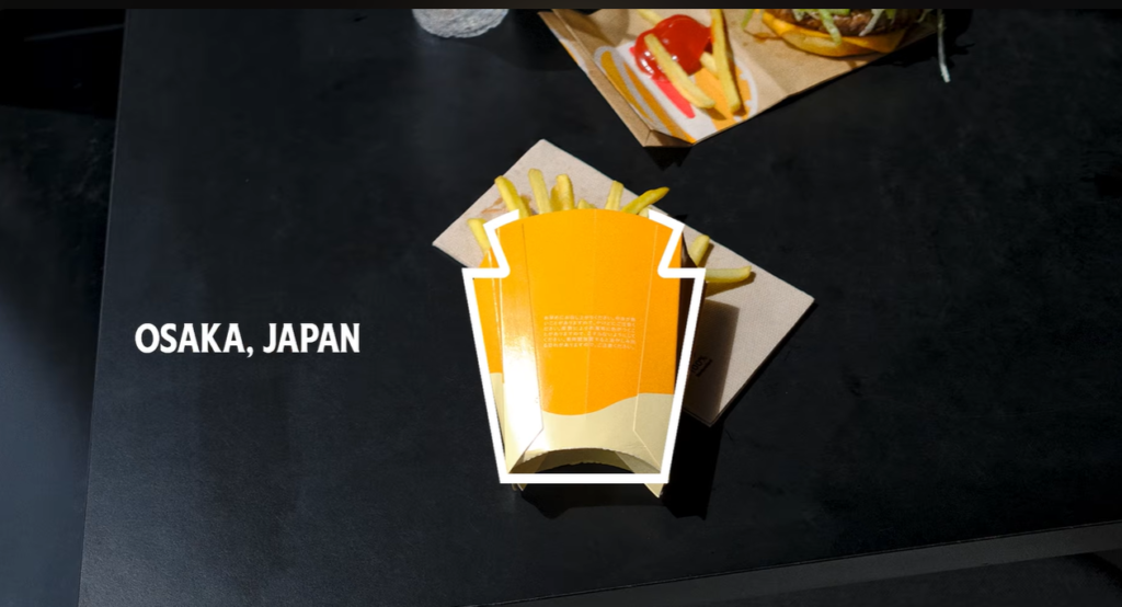
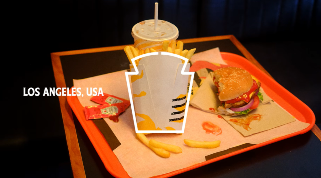
A standard fry box is a tall, tapering rectangular container with a wider opening at the top. The Heinz logo, one of the most distinctive in food marketing, is a keystone shape. The same tall, tapering silhouette. The same wider opening at the top. The fry box and the Heinz logo are the same shape, and they have been the same shape for over a century without anyone pointing it out.
That observation is the entire campaign. “Look Familiar?” runs as a headline alongside a fry box, and the visual answer is immediate and irrefutable. The fry box is a Heinz logo. Every fry box, in every restaurant, in every country on earth, is a piece of free Heinz brand media, and it has been for over a century without the brand claiming it.
The Execution
The campaign was built around a single visual, the fry box, requiring no words to function in any language. That translation-free quality shaped the media strategy directly. High-impact posters ran across roadside and metro sites in China, Canada, Brazil, Mexico, the UAE, the United States, and the United Kingdom, placed specifically in city centres and transit hubs where on-the-go fry consumption peaks, so the observation met people at the moment of maximum relevance: mid-craving.
The OOH placement in China included a specific and deliberate location, the Shanghai metro station nearest to McDonald’s China’s own office. The competitive signal was not accidental.
The Uber Eats Integration
To close the gap between recognition and purchase, Heinz built a first-of-its-kind Uber Eats integration that added Heinz Ketchup to fry orders across the platform, whether or not the restaurant in question actually stocked the product. The mechanic turned a visual brand awareness campaign into a direct commerce tool, converting the moment of craving into an actual transaction. US in-platform sales on Uber Eats rose 222% during the campaign period.
The Commercial Results
The campaign ran across 33 markets. In the US, distribution points rose 9.78%. In Canada, household penetration climbed from 7% to 10.31%, with gross sales value hitting $18.5 million in 2025. The UK posted a 4.37% lift in volume market share. Mexico grew volume share 3.58%. The campaign generated 150-plus trade and lifestyle mentions, with Heinz appearing in 86% of headlines, outperforming its previous “It Has to Be Heinz” campaign.
Forty-two percent reach was achieved in the UAE. Thirty-three percent in Toronto. The scale showed not only that the insight travelled but that it converted at point of sale rather than simply generating awareness metrics.
The Cannes Recognition
Look Familiar? won the Print and Publishing Grand Prix at Cannes Lions 2026. The jury’s recognition reflected what the case study itself makes clear: this is a campaign built on a hidden-in-plain-sight truth that had been sitting inside the category for 150 years, waiting for someone to name it. Once named, it became impossible for any fry consumer to unsee. And once impossible to unsee, every fry box in the world became a Heinz advertisement.
That is not a media buy. That is a claim on the category itself.
Campaign Name: Look Familiar?
Agency Name: Rethink, Toronto
Brand Name: Heinz / Kraft Heinz
Location: Global (33 markets including USA, Canada, UK, China, Brazil, Mexico, UAE)